
How Much is the US in a Bubble?
Below is a section of our latest quarterly strategic portfolio update - namely, Section 9: The Global Valuation Chartbook - which outlines key valuation themes across various markets and sectors.

Valuation Overview
Valuation models are poor market timing tools.
That was the conclusion of our analysis of the efficacy of the PER and ERP in forecasting 1 and 3 year returns in the stock market. In that 2006 analysis (“Does Valuation Matter?”), we looked at over 100 years of data using a forward PER for the S&P500 on the 1st January each year (based on the following 12 months’ actual earnings1) and plotted that ratio against the S&P’s returns over the course of that year (following 12 months). The resulting graph can be seen below in fig 9, and shows that there is zero correlation between the two variables. Similar exercises were carried out for a 3 year return period and for the ERP (with the same result). Valuation ratios are clearly, therefore, not good market timing tools.
Fig 9: S&P500 PER vs. next 12 months’ equity market returns (scatter diagram)
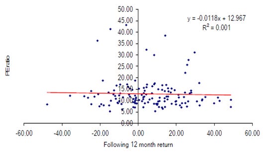
Source: Longview Economics
Valuations do, however, have a part to play in asset allocation (& general investing). As Kindleberger highlights in his ‘bubbles’ framework, all bubbles end up with rich/high valuations (which then pop when the ‘cheap money’ is removed). Equally relative valuation extremes (e.g. between two countries’ equity markets, two key assets and/or two key global sectors) are also interesting and, when paired with a changing global macro theme, highlight significant emerging opportunities. The start of new secular cycles in global markets (and therefore a switch of global leadership) also typically happens when relative valuation pairs have reached extremes.
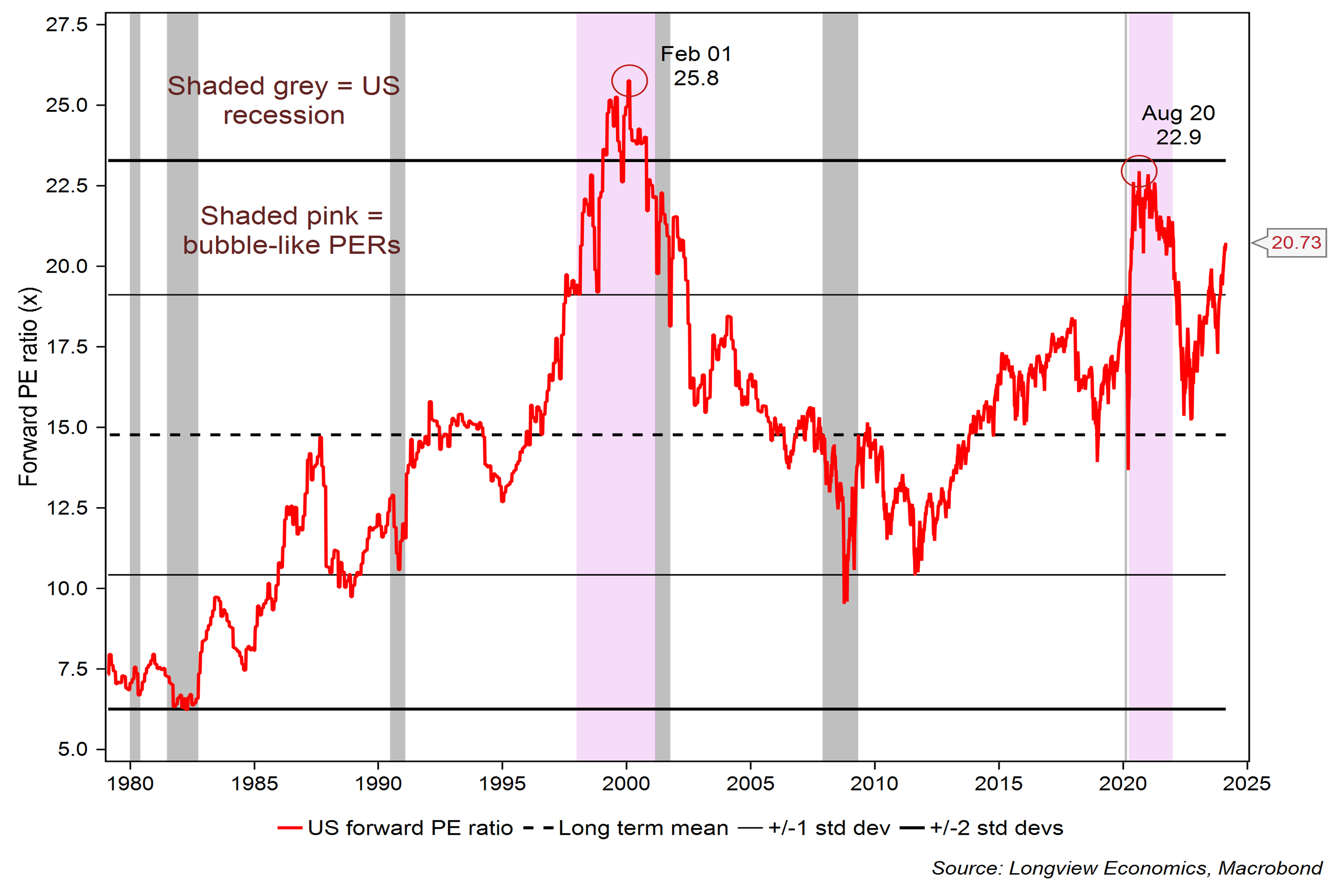
Fig 9i: S&P500 12m forward PE ratio (based on rolling consensus EPS)
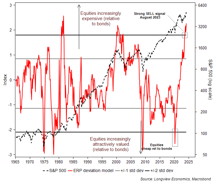
It’s in that vein, therefore, that it’s interesting to note that the US equity market, in the past three months, has reached notably expensive levels on a variety of measures. The S&P500’s equity risk premium, for example, has fallen below 3% for the first time since the TMT bubble. Over the past 18 months that measure of the market’s valuation has fallen steadily (from around 5 – 6% ERP from 2014 through to late 2022) down to 2.9% (latest data, see fig 9ii). That risk premium looks at the S&P500’s earnings yield relative to its real bond yield. Other US risk premium measures have a similar message. The equity market measured against real cash rates also shows a risk premium that is notably rich (also only surpassed during the TMT bubble). Added to which, our in house valuation model, which looks at the distance from the observed to the equilibrium risk premium is also on strong SELL (fig 9iii).
Other approaches to valuing the US market have the same message. The S&P500’s PE ratio (based on forward 12m rolling consensus earnings) is at one of its highest levels in the past 45 years (i.e. all the history we have using forward consensus EPS, see fig 9i). On the latest data the PER is 20.7x. As the chart shows, only in the pandemic liquidity fuelled market (2020/21) and the TMT bubble, did the S&P500 have a higher PE ratio. At all other times over the past 45 years, it’s been lower. The Shiller CAPE ratio has a similar message, reaching 33x in recent weeks (above its 1929 peak just ahead of the October 1929 crash and only surpassed in the pandemic and the TMT bubble, fig 9xvii).
Fig 9ii: US equity risk premium (earnings yield less real bond rate)
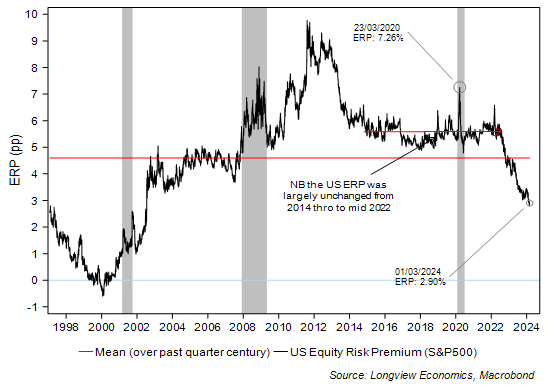
Fig 9iii: Longview dynamic ERP valuation model vs. S&P500
The Single Stock Valuation Message
From a single stock perspective, the message of the analysis is more mixed.
Keep reading with a 7-day free trial
Subscribe to The (Long)View From London to keep reading this post and get 7 days of free access to the full post archives.